
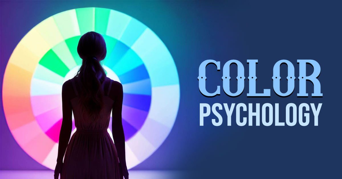
In the intricate tapestry of marketing, the choice of colors is more than a visual decision—it’s a psychological one. Colors have the power to evoke emotions, influence perceptions, and shape consumer behavior. Understanding the psychology of color in marketing is a strategic advantage that businesses can leverage to create impactful brand experiences. In this exploration, we dissect how different colors resonate with consumers and the profound impact they have on purchasing decisions.
1. Red: The Power of Passion and Urgency
Red is a color that commands attention and elicits strong emotions. It is often associated with passion, energy, and urgency. In marketing, red is strategically used to create a sense of excitement, evoke urgency in limited-time offers, and stimulate appetite in the food industry. Brands like Coca-Cola and Target utilize red to stand out and convey a bold, dynamic message.
2. Blue: Trust, Calmness, and Reliability
Blue exudes a sense of trust, calmness, and reliability. It is a widely used color in corporate branding to convey professionalism and stability. Many tech companies, such as IBM and Dell, incorporate blue to instill confidence in their products and services. Additionally, blue is often associated with serenity, making it suitable for brands promoting wellness and relaxation.
3. Green: Nature, Health, and Growth
Green is inherently linked to nature, health, and growth. It symbolizes freshness, vitality, and environmental consciousness. Brands in the health and wellness sector, such as Whole Foods and Spotify, often utilize green to convey a sense of well-being and growth. Green is also associated with money, making it a suitable choice for financial institutions.
4. Yellow: Optimism, Clarity, and Warmth
Yellow radiates positivity, optimism, and warmth. It is a color that grabs attention and is often used to highlight important information. Brands like McDonald’s and IKEA leverage yellow to convey a sense of friendliness, clarity, and affordability. Yellow can create a welcoming atmosphere and is effective in encouraging impulse buying.
5. Purple: Luxury, Sophistication, and Creativity
Purple is associated with luxury, sophistication, and creativity. It is a color often chosen by brands aiming to convey elegance and uniqueness. Companies like Cadbury and Hallmark utilize purple to stand out and create a sense of exclusivity. Purple is also linked to creativity and is used by brands in the beauty and artistic industries.
6. Orange: Energy, Enthusiasm, and Playfulness
Orange is a vibrant and energetic color that radiates enthusiasm and playfulness. It is attention-grabbing and often used to create a sense of excitement. Brands like Fanta and Nickelodeon incorporate orange to convey a fun and dynamic personality. Orange is effective in promoting impulse purchases and evoking a sense of youthful exuberance.
7. Black: Sophistication, Power, and Elegance
Black is a timeless and versatile color associated with sophistication, power, and elegance. It is often used in luxury branding to convey a sense of exclusivity and prestige. Brands like Chanel and Rolex use black to create a sleek and high-end image. Black can also be paired with other colors to enhance contrast and create a visually striking effect.
8. Pink: Femininity, Romance, and Playfulness
Pink is a color often associated with femininity, romance, and playfulness. It is widely used in industries related to beauty, fashion, and sweets. Brands like Victoria’s Secret and Barbie leverage pink to appeal to a feminine audience and evoke a sense of charm and romance. Lighter shades of pink can convey a softer and more nurturing image.
9. Brown: Earthiness, Durability, and Simplicity
Brown is a down-to-earth and reliable color associated with earthiness, durability, and simplicity. It is commonly used by brands in the food and outdoor industries to convey a sense of natural authenticity. Brands like UPS and Hershey’s use brown to evoke feelings of reliability and simplicity.
10. White: Purity, Simplicity, and Cleanliness
White symbolizes purity, simplicity, and cleanliness. It is often used to create a sense of openness and clarity. Brands like Apple and Nike utilize white to convey a sleek and minimalist image. White is also effective in creating contrast and highlighting other colors, making it a popular choice for brands aiming for a modern and clean aesthetic.
Understanding the psychology of color in marketing is a nuanced and strategic aspect of brand development. By aligning color choices with the desired emotions and perceptions, businesses can create a powerful and cohesive brand image that resonates with their target audience, influences purchasing decisions, and fosters lasting brand connections.
Comments are closed.